Aeris AerTrak IoT Fleet Management App Redesign
Migrate an existing app from Google's Material Design to a newly-established design system. Establish a beta environment to allow users to test the new platform before launch.
CLIENT
Aeris Communications
ROLE
Stakeholder Management
User Research
Wireframing
Prototyping
Testing
Visual Design
TOOLS
Figma
Sketch + Invision
(earlier interations)
Illustrator
Photoshop
KEY RESULTS
Beta environment created to test features with users
Marketing pipeline established to prepare users for updates
Visual design in alignment with brand
Framework and centralized design system sync with React libraries
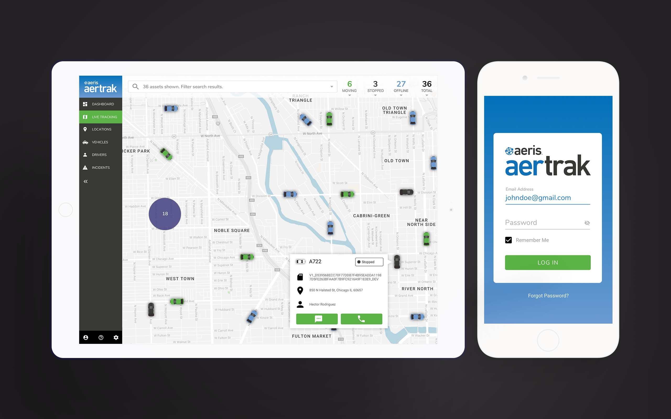
OVERVIEW
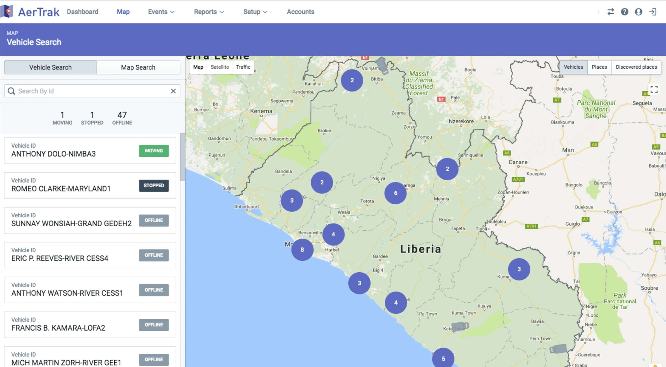
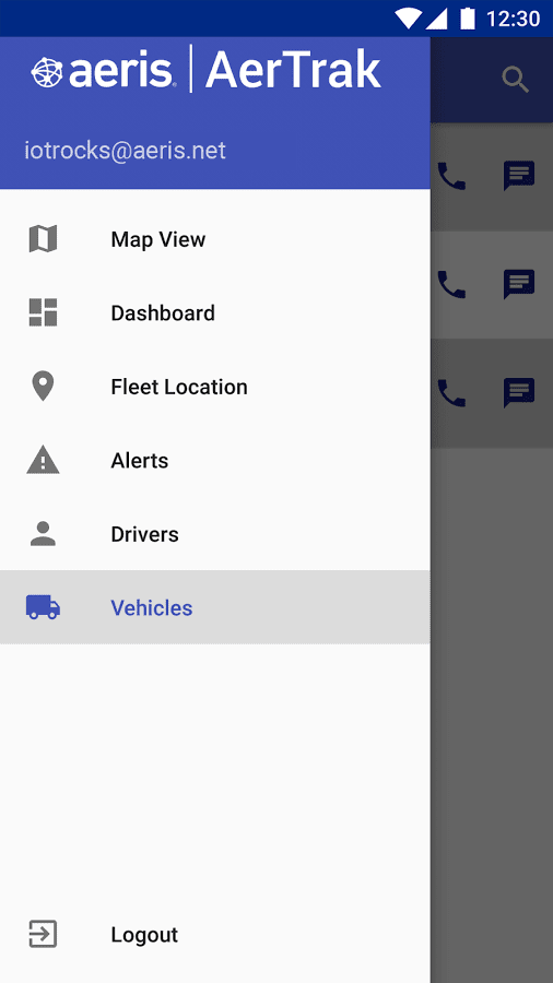
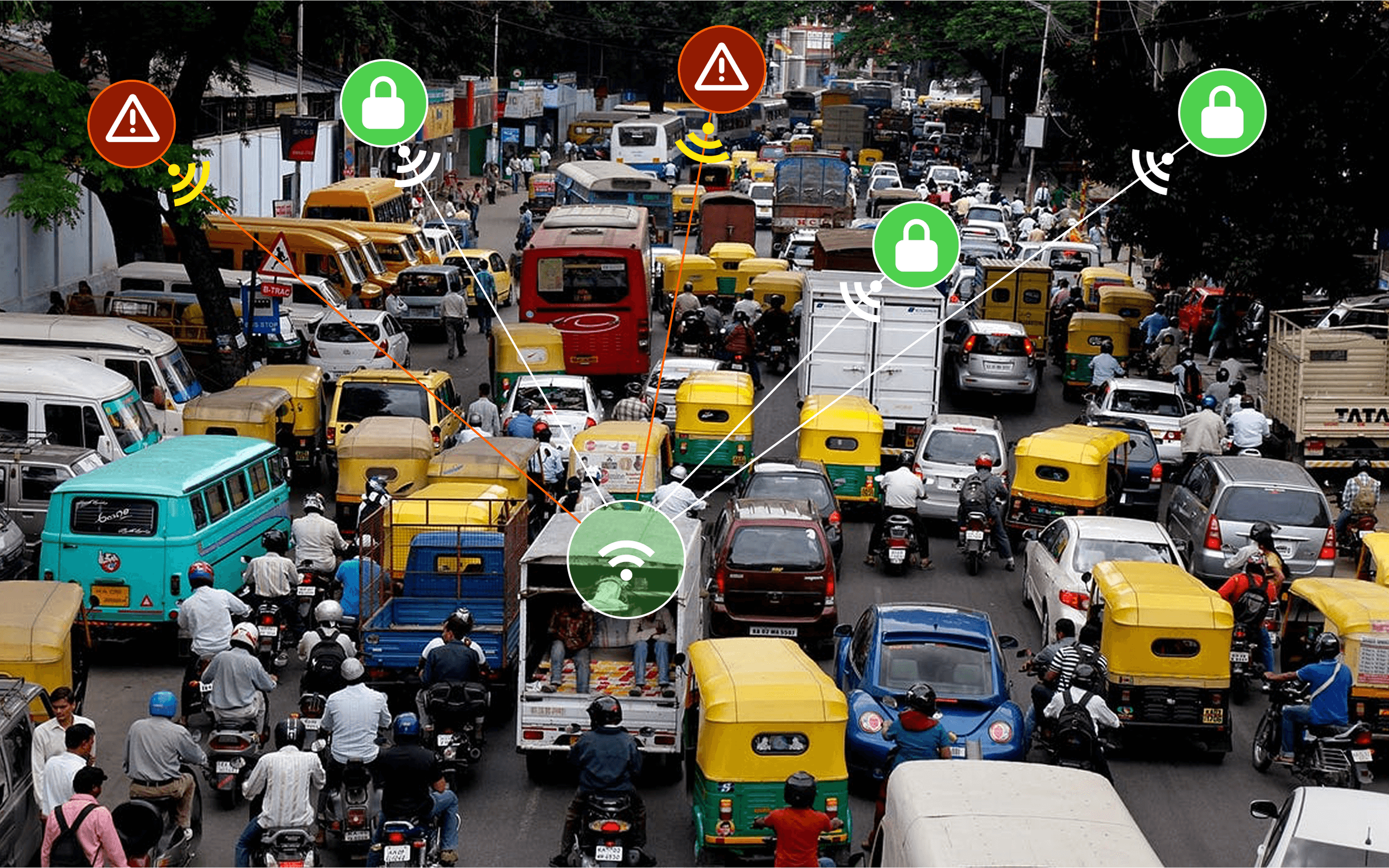
Aertrak is an IoT fleet management solution that serves markets in India, Vietnam and Indonesia. With a SIM inside a device, a vehicle can be tracked and gather data like speeding, crashing, hard braking and turns. A fleet manager can set up geofences (a virtual boundary using GPS or similar systems) for groups of vehicles in order to keep those assets within optimal routes and reduce theft. A separate app for drivers allows for onboarding and connection within fleets.
CHALLENGE & GOALS
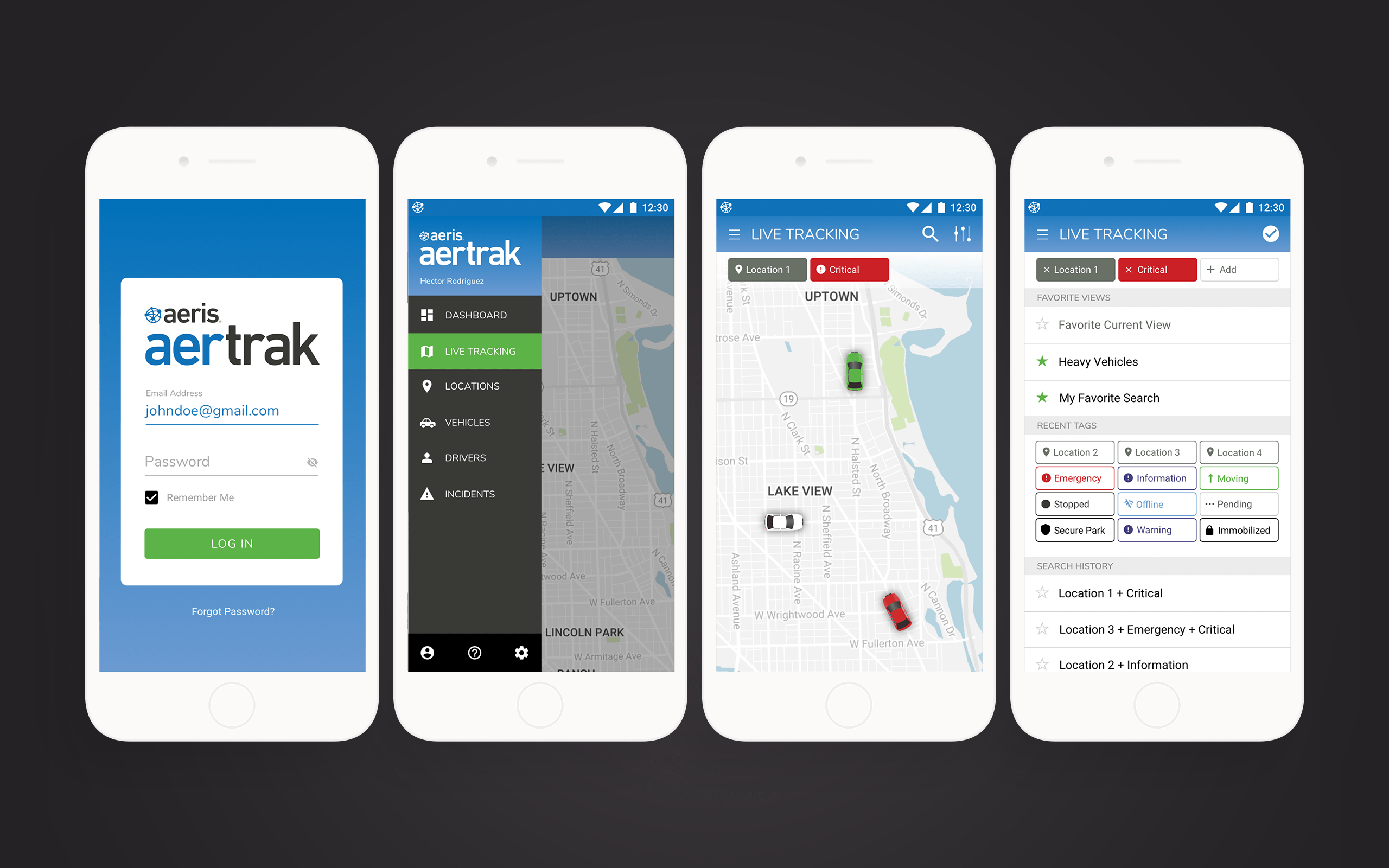
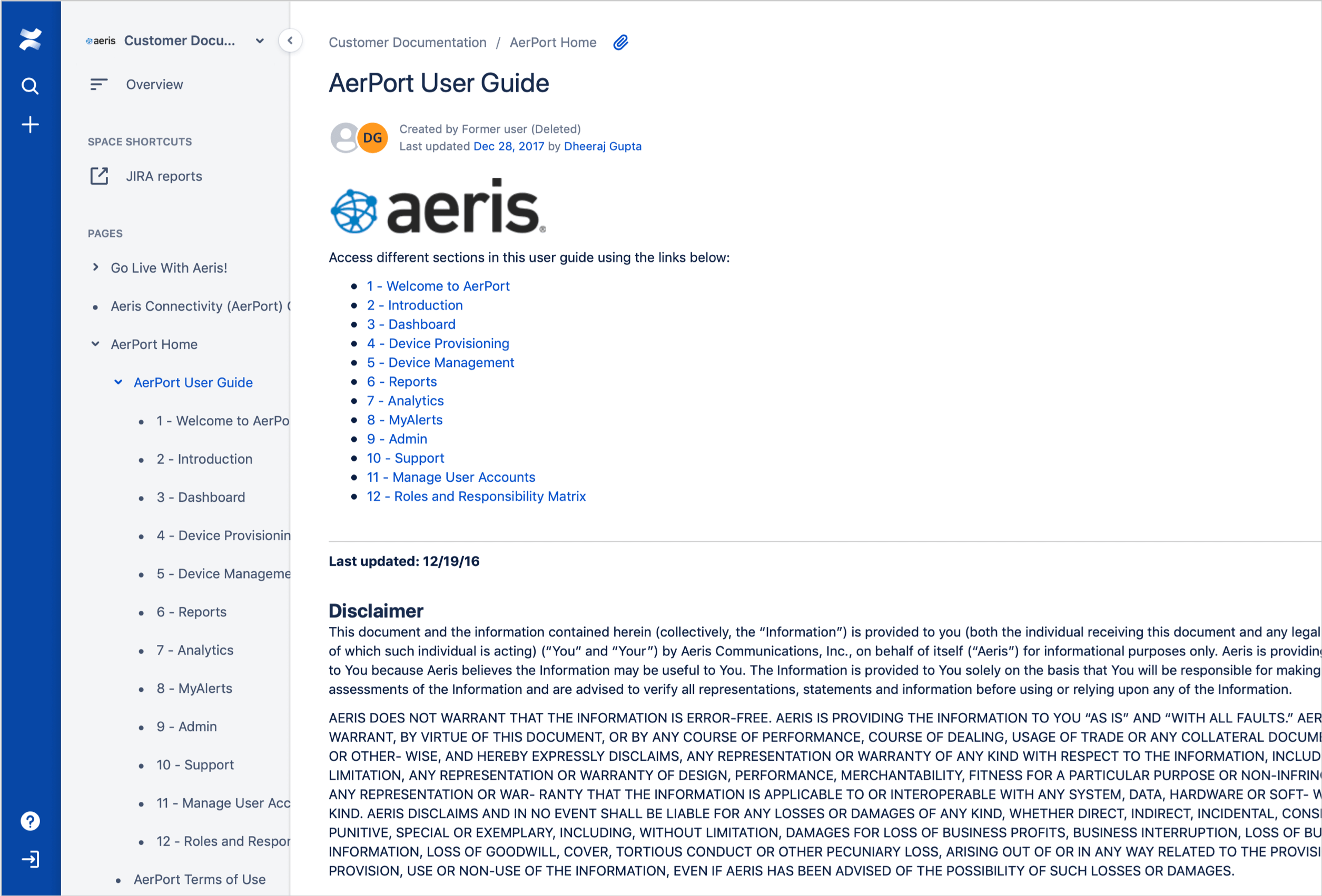
The app was based on Google's Material Design framework, and needed to move to a newly-developed product design system. There was a large delta between the old and new design systems, so development created a beta environment that would allow users to try out the new system and provide feedback.
REQUIREMENTS & METRICS
Working closely with the development team, the following criteria were identified:
- Transition site from Material Design to the newly-created product design system
- Create a beta environment that would allow users to try out the new interface and switch seamlessly between old and new UI
- Keep feature parity with existing app during beta period
- Notify users the change was coming while reassuring them the functionality would remain similar
- Resume feature enhancements and upgrades on an Agile development cycle
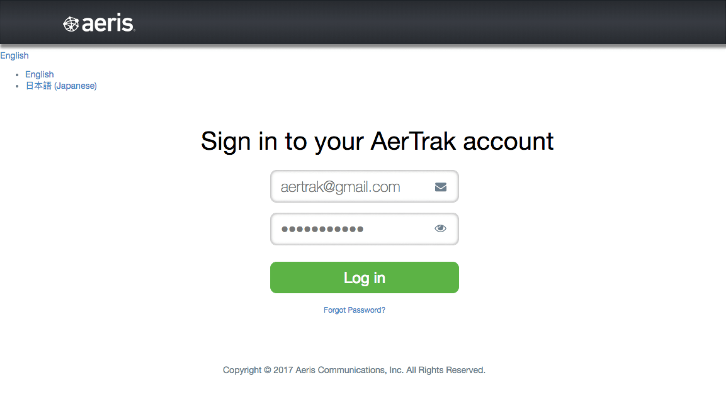
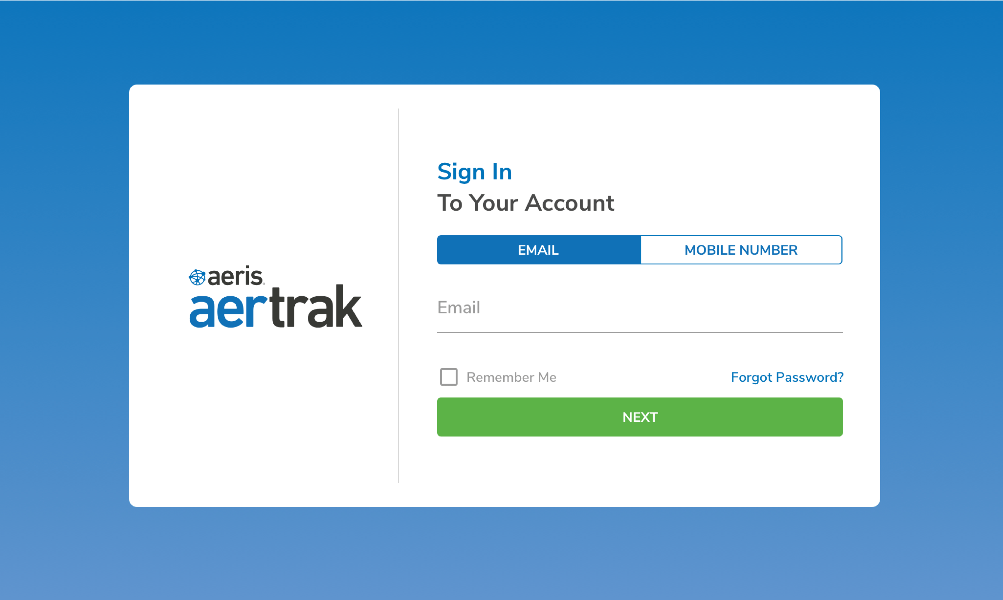
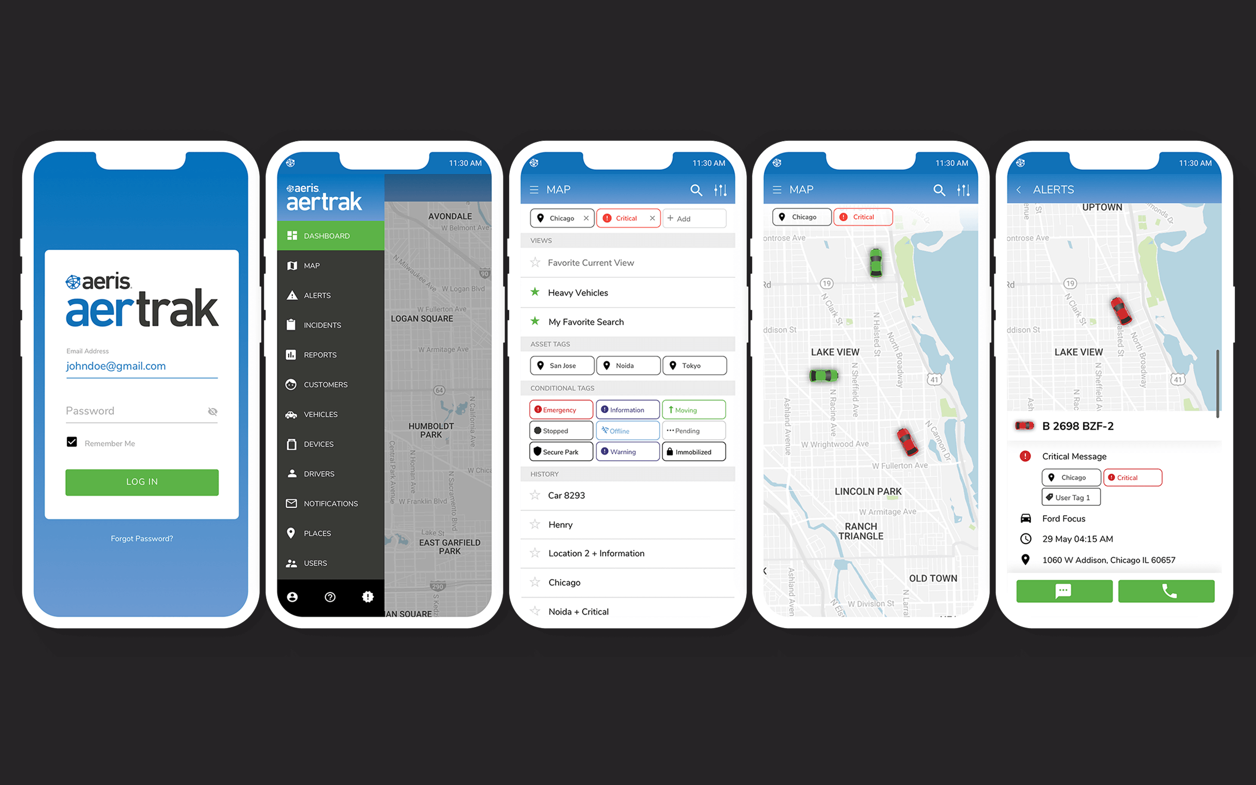
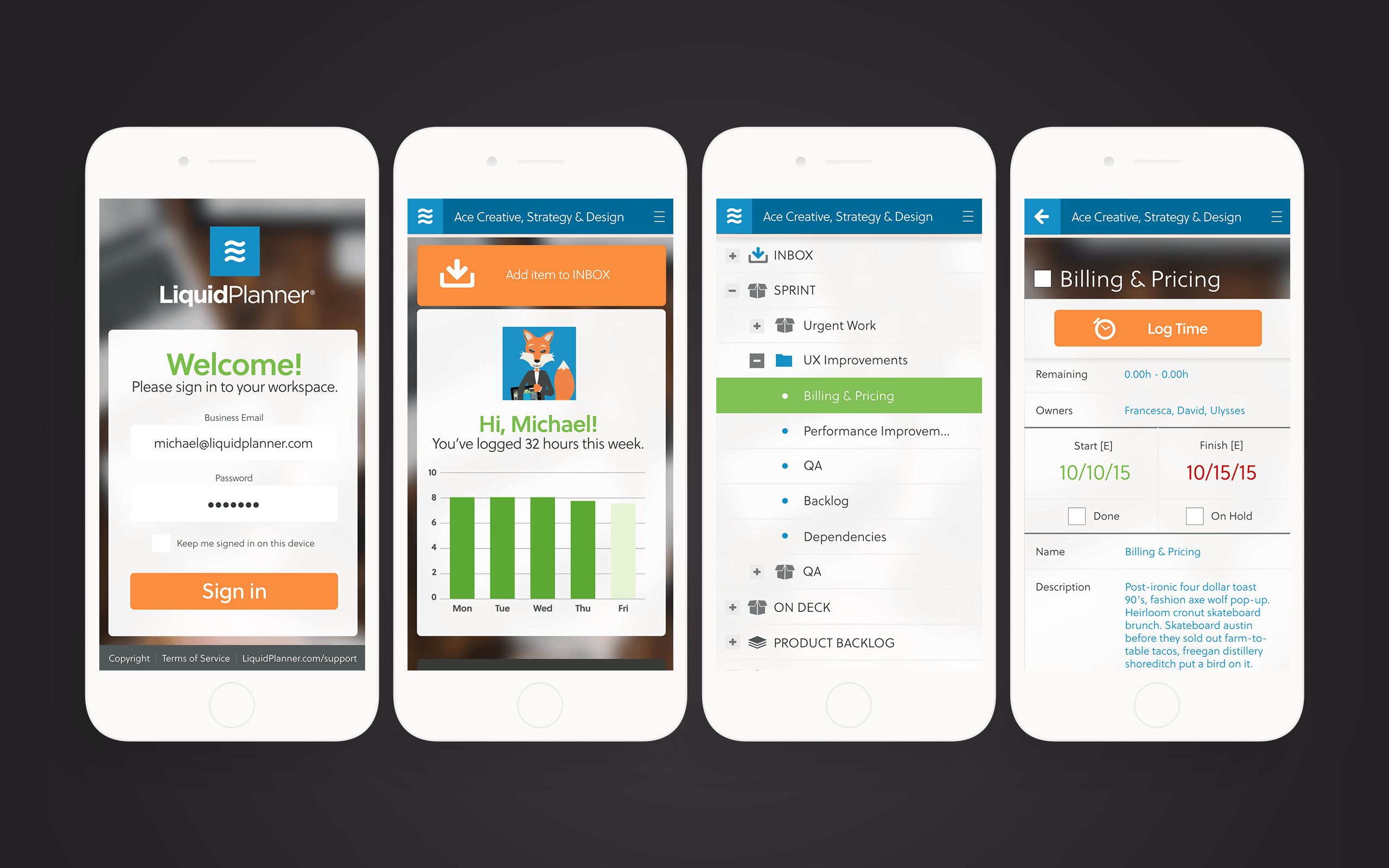
After identifying requirements, the upgrade path started with a login screen update and moving the existing app to new color palette and typography to ease the transition to greater changes to come.

FEATURE UPGRADES
Over the course of the next sprint, user feedback was collected and weighted, and adjustments made as needed. Over three sprints, having addressed and evaluated user feedback, the beta was shut down in favor of the new user interface.
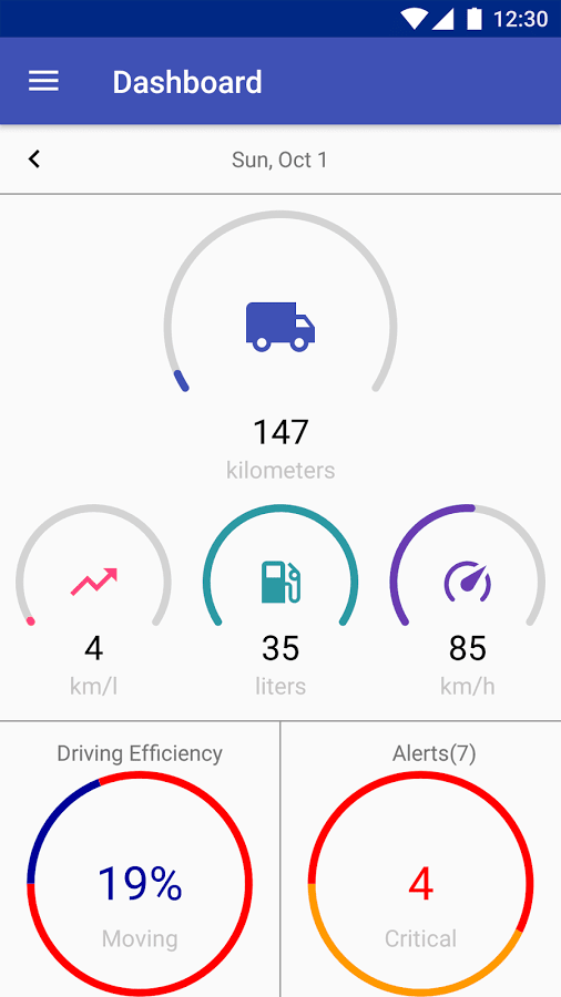
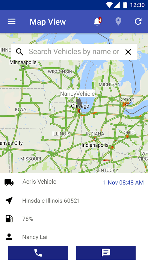
Features like fleet dashboards, data insights and a new search paradigm were evaluated for inclusion in future product releases.
Search, dashboard and data insight explorations.


RESULTS
The app moved to the new design system and provided both brand continuity and increased brand trust. A user feedback loop was introduced to help inform major and minor feature updates.
Selected Works


Hey there, this is the default text for a new paragraph. Feel free to edit this paragraph by double clicking on it. After you are done just click on the michael[at]mocreate.com Fun!